electronic.alchemy :: start
electronic.alchemy
where the past meets the future

Spotlight refined: get it for free

Friday, 16 June 2006 by Bill Welliver

The folks over at MacZOT are at it again. This time, it's a tool that's even more useful than the last. They're looking to give away HoudaSpot, which is a nifty little front end for Spotlight. Even better, it corrects some of the pesky little tendencies about Spotlight that I've been frustrated with. Plus, with my 100 gb disk drive hovering around 10gb free, I'm motivated to figure out what I've done with the other 90g!

First of all, while the whole "search as you type" thing is a nice idea, the reality is that most of us just don't have the horsepower to spare to make that happen. I'd get two or three characters into my search string, and things would lock up for 20 seconds. Not my idea of making my life easier or faster. HoudaSpot patiently waits till you're done typing in the criteria before it goes searching for your things. Then you can be amazed at how fast Spotlight really is!

Second, you can save your search criteria for use later as a "template" search. Nice.

Third, the search remains live (not sure if that's the case with out of the box spotlight or not. That means if you go moving things around or add files that fit the criteria, they automatically show up in your search.

Anyhow, they're looking to get people to try it out and write reviews today. For each registered review on June 16, 2006, the folks at MacZOT will knock a nickel off the selling price. If it gets to the end of the day and the price is zero dollars, everyone who wrote in gets it for free. You can also buy it at the current going price, which is a steal anyhow.

Not categorized | Spotlight refined: get it for free |

Collaborative editing for Mac: on sale, too!

Tuesday, 25 April 2006 by Bill Welliver

Well, here's an interesting idea I've not heard of before: a company called MacZOT is using bloggers to drum up business for their discount software sales business. I'm not completely sure I understand the concept, but they seem to be offering well known shareware (for the Mac in this case) at a discount.

The software in this case is SubEthaEdit from CodingMonkeys. If you've never used SubEthaEdit before, it's kind of a jarring experience. We first played around with it at the Pike conference in Essen two years ago. It's Bonjour enabled, so everyone in your area who's using the application can collaboratively edit documents with each other. You see the editing as it happens. It's pretty neat. Not exactly what you want for every document, but there are lots of great applications, especially when brainstorming. If you know lots of Mac users and wished you could collaborate more effectively, this is the tool for you.

Anyhow, here's the deal: for each post about it, they reduce the price for everyone by 5 cents. Right now, it's at $20, which is a pretty good deal as it is. If it hits zero, it's free for everyone who participated by writing about the promotion. They're calling the whole thing "BLOGZOT 2.0 on MacZOT.com". They also claim that MacZOT and TheCodingMonkeys will award $105,000 in Mac software, someone else will have to do the math. Perhaps I'm just not young and hip enough to get the edgy names and whatnot, but I like the idea, especially if people write informative posts about any of this.

Not categorized | Collaborative editing for Mac: on sale, too! |

New AJAX sample application for Fins

Tuesday, 25 April 2006 by Bill Welliver

I was surfing around the other day and ran across a little screencast[1] on the Ruby on Rails website. The point of the screencast was basically demonstrating how to create an AJAX application in a few minutes using Rails and Prototype (a javascript library). Well, obviously Ruby doesn't have the market cornered on ease of development. We in the Pike world have options, too.

So, last night I threw together the Fins[2] equivalent that searches SmugMug[3] for images and returns the results to you. It's functionally equivalent to the Rails demo application that uses Flickr.

A running instance of the sample app can be found here:

[external]http://buoy.riverweb.com:9098/

The code is available here:

[external]http://hww3.riverweb.com/dist/Fins/samples

You'll note that most of the bulk of the download consists of the Dojo[4] javascript library we're using to achieve some of the client side functionality. You'll also need to download Fins, which can be found in the directory immediately above. Simply untar both files, and run

./fin_serve.pike -p yourportnumber /path/to/smugmug

If you don't have the Public.Image.SmugMug and Public.Web.RSS modules, this app won't do much for you, but that's sort of beside the point.

The only other difference between the amount of work required to achieve the pike version is that you're responsible for doing a lot of the javascript work yourself. I'm not sure how I feel about the Rails way of doing things, which is to say there's a lot of magic involved. I suppose it might be worthwhile to build some convenience functions that make some of this easier.

As always, comments and suggestions are welcome!

[1] [external]http://media.rubyonrails.org/video/flickr-rails-ajax.mov
[2] [external]http://hww3.riverweb.com/space/pike/Fins
[3] [external]http://www.smugmug.com
[4] [external]http://www.dojotoolkit.org

Posted in web apps, Fins and pike | New AJAX sample application for Fins |

It's almost brewing time!

Saturday, 8 April 2006 by Bill Welliver

With the arrival of spring, my thoughts have begun to turn to brewing. Last year was kind of dry; I was rather busy and didn't get around to brewing at all, though I did make a batch of wine: a nice Mösel Valley Reisling that's shaping up nicely. My goal is to get out of the gate early this year; March didn't happen, but I'm intent on getting something going this month. My first batch will be something called Klangfreudenfestbier, from http://www.morebeer.com; which is a Vienna style lager, and I'm looking forward to trying it. I'd also like to make some Kölsch again this summer, and maybe a wheat beer (can you tell I'm heavily influenced by German styles?)

While on the subject, I got a tremendous craving the other day for Kôlsch… about the only true specimens you can get on this side of the Atlantic are Reissdorf and Gaffel. I much prefer the latter, with its slight bitterness and a hint of honey. They don't hold a candle to my absolute favorite: http://www.paeffgen-koelsch.de/. You can't get it here, and that's a shame, but it's much better consumed at their tap in Cologne's Altstadt. It's much like the beer halls of Munich, but on a smaller, less commercial scale. The food is traditional German fare, and it's quite tasty. I had a wild boar medallion with a red wine gravy and poached pears and cabbage. Very deep flavors and quite satisfying. The beer is the real reason to go there: golden, fruity and a good bit more bitter than most other Kôlsches. Served in traditional slender The atmosphere is just wonderful; like a trip back in time, and it's a great place to jot down some notes or write some postcards.

Anyhow, enough dreaming and time to actually get brewing!

Posted in brewing | It's almost brewing time! |

Time for an update

Thursday, 6 April 2006 by Bill Welliver

Well, since I've been on a roll for the past few days, I thought I'd keep it up by giving my personal website a much needed facelift. I upgraded the FinScribe software running the site to the latest development code, and installed a slightly modified version of the prozac theme I ported yesterday. I even dug through my old images for something to make it my own: a photo taken at the Essen Hauptbahnhof during my last trip to Germany, about year or so ago. I like the feeling of timelessness and motion as the night train speeds through on its way to far off places.

I haven't updated all of the content that predated the new website software yet, so you'll probably run into some pages that still reflect the old look and feel. Hopefully that will change over the next week or so as I get that taken care of, too.

So, dear visitor, I welcome you to give me your feedback on the new look… do you like it? Does it turn your stomach (I hope not)? Post a comment or write me!

Posted in Personal | Time for an update |

FinScribe's first theme!

Wednesday, 5 April 2006 by Bill Welliver

I took some time today to create the first "real" theme for FinScribe. Ok, I didn't create from scratch, but rather decided to take a good looking theme from WordPress, called Prozac, and convert it so that it worked with FinScribe. Along the way, I made some tweaks to the theme and made some changes to the internal templates in order to make it easier for theme builders. The exact origins of Prozac seem to be spread across a few people, so I'll refer you to the site I got the source for additional information: http://weblogtoolscollection.com/archives/2006/03/03/wp-themes-prozac/

I think the result is the best of both the original theme, and of the capabilities of FinScribe: a good looking design with all of the nice CMS functionality and AJAX enhancements that come with FinScribe. All in all, not a bad showing.

So, without further ado, I give you Prozac for FinScribe:

You can get the theme http://hww3.riverweb.com/dist/FinScribe/themes/. To use it, simply untar the file into the themes directory (you'll need a copy of FinScribe from CVS for this to work). Then set the site.theme property to "prozac". Currently you have to make this setting change by hand using fin_serve's hilfe mode, or by editing the database directly. I hope to make an official release of FinScribe that supports themes out in the next day or two, as well as a better preference modification mechanism.

Posted in FinScribe | FinScribe's first theme! |

Themes arrive for FinScribe

Tuesday, 4 April 2006 by Bill Welliver

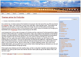
For a while now, I've been aware of the fact that not everyone likes the look of the out of the box theme for FinScribe. Heck, I don't even like it, but I'm busy with other, more important work. The problem has been that, up until today, it's been pretty difficult to change the look and feel without doing some mucking around in the core code. It's true that there was a certain amount of flexibility by changing the stylesheets (ala http://snipsnap.org), but you could only go so far with it.

Just checked into CVS is a set of changes to FinScribe and the underlying Fins framework that makes all of this a thing of the past. To create a new theme, simply copy create a new directory in the themes directory, and start elements of the default theme (currently located in themes/default and templates/) with files created in the new theme directory. You only need to change the files you want to be different, so if you really only want to fiddle with the weblog entry layout, you don't have to copy anything else to your theme. Once you've done that, just change the preference "site.theme" to be the name of the theme directory. Currently, that's the hard part, because there isn't a useful preference editor, so you'll have to use fin_serve in hilfe mode, or edit the database directly. But, it's far more doable than before, and you don't have to worry about really messing things up, because you can just revert to the default theme if things go wrong.

I'll try to get a new release out in the next few days, as this is a big deal. Hopefully some enterprising designers will come up with some new themes that don't look quite as ugly as the default. Well, one can wish, right?

Posted in web apps and pike | Themes arrive for FinScribe |

A custom Dojo widget

Tuesday, 21 February 2006 by Bill Welliver

I've been playing around with Dojo for the past few weeks, using it to add some rich functionality to the FinScribe application. In addition to having a number of useful methods that are useful for general Javascript projects, Dojo includes a pretty nifty widget system. http://www.dojotoolkit.org includes a number of pre-written widgets, including a cool "fisheye list" that's similar to the effect you get from the Mac OSX dock. The widget system also allows you to enhance and create new widgets outside of the Dojo core distribution.

One of the itches that I've found myself scratching over the years is the idea of what I'll call the "add/remove membership" widget. Really a compound widget, it's the one you typically see when there's a list of potential members and a list of members and a set of buttons that let you add or remove members (http://hww3.riverweb.com/hdadmin/screenshots/usergroup.png. I've implimented this in HTML and GTK on more than one occasion, but haven't ever really been happy with the result. One of the big problems is that my previous attempts weren't atomic. By atomic, I mean that you can make a number of changes to the list and then either commit or cancel.

FinScribe's administration interface includes a user and group management tool, so once again, I find myself in need of this imfamous widget. My bright idea was to develop a generic widget using Dojo that I can then use for multiple purposes. The problem with writing Dojo widgets is that there's little in the way of documentation that will be helpful. http://dojotoolkit.org/docs/fast_widget_authoring.html and http://www.richardrodger.com/roller/page/richard/Weblog/dojo_progress have both written some material, but for the most part, you're in uncharted territory. Reading through the dojo source is a critical component, and it really helps to have a good understanding of Javascript and its approach to object orientation (which I don't really posess.) Nevertheless, after a day of playing around, I think I came up with a workable solution.

The new widget, which I call a ComboPicker (yes, I know it's a dumb name) is generic and atomic. It takes a pair of methods that are used to supply the "possible members" and "current members" pool. The cool thing is that the widget makes sure that a given entry will appear in only one of the two lists at any given time. It also keeps track of the additions and removals based on the original state of the membership pool. On the output side, there are methods that can be used to get the additions and deletions, and if you place the widget in a form, the ComboPicker can hook into the form and populate a pair of input fields with the list of changes. I've added the widget to FinScribe, and you can see it in the edit groups feature in the admin interface.

Future directions might include the ability to order the members list (for use in situations where order is significant). You can download a ZIP file with the latest version from CVS, and check out the ComboPicker widget page for an example of its use. After this experience working with Dojo on a relatively complex UI component, I have to say I'm even more impressed with the Dojo event and widget systems. This is really powerful software.

Posted in web apps | A custom Dojo widget |

A custom Dojo widget

Tuesday, 21 February 2006 by Bill Welliver

I've been playing around with Dojo for the past few weeks, using it to add some rich functionality to the FinScribe application. In addition to having a number of useful methods that are useful for general Javascript projects, Dojo includes a pretty nifty widget system. http://www.dojotoolkit.org includes a number of pre-written widgets, including a cool "fisheye list" that's similar to the effect you get from the Mac OSX dock. The widget system also allows you to enhance and create new widgets outside of the Dojo core distribution.

One of the itches that I've found myself scratching over the years is the idea of what I'll call the "add/remove membership" widget. Really a compound widget, it's the one you typically see when there's a list of potential members and a list of members and a set of buttons that let you add or remove members (http://hww3.riverweb.com/hdadmin/screenshots/usergroup.png. I've implimented this in HTML and GTK on more than one occasion, but haven't ever really been happy with the result. One of the big problems is that my previous attempts weren't atomic. By atomic, I mean that you can make a number of changes to the list and then either commit or cancel.

FinScribe's administration interface includes a user and group management tool, so once again, I find myself in need of this imfamous widget. My bright idea was to develop a generic widget using Dojo that I can then use for multiple purposes. The problem with writing Dojo widgets is that there's little in the way of documentation that will be helpful. http://dojotoolkit.org/docs/fast_widget_authoring.html and http://www.richardrodger.com/roller/page/richard/Weblog/dojo_progress have both written some material, but for the most part, you're in uncharted territory. Reading through the dojo source is a critical component, and it really helps to have a good understanding of Javascript and its approach to object orientation (which I don't really posess.) Nevertheless, after a day of playing around, I think I came up with a workable solution.

The new widget, which I call a ComboPicker (yes, I know it's a dumb name) is generic and atomic. It takes a pair of methods that are used to supply the "possible members" and "current members" pool. The cool thing is that the widget makes sure that a given entry will appear in only one of the two lists at any given time. It also keeps track of the additions and removals based on the original state of the membership pool. On the output side, there are methods that can be used to get the additions and deletions, and if you place the widget in a form, the ComboPicker can hook into the form and populate a pair of input fields with the list of changes. I've added the widget to FinScribe, and you can see it in the edit groups feature in the admin interface.

Future directions might include the ability to order the members list (for use in situations where order is significant). You can download a ZIP file with the latest version from CVS, and check out the ComboPicker widget page for an example of its use. After this experience working with Dojo on a relatively complex UI component, I have to say I'm even more impressed with the Dojo event and widget systems. This is really powerful software.

Not categorized | A custom Dojo widget |

All hot metal, all the time...

Wednesday, 25 January 2006 by Bill Welliver

This past weekend, my father and I spent some time getting the gas pot on my composition caster fired up. We had a few hair raising moments due to the fact that one of the three gas orifices had been removed, resulting in a giant flame-up about 20 seconds after lighting the burner. After replacing the orifice (which was safely tucked away in a spare parts box) and brazing a small burn hole in one of the mixing chambers.

Well rested and ready for a second go, we put everything back together Sunday. Luckily, things went much more smoothly. In fact, we got the pot filled about 2/3 of the way with freshly melted type. We just need to make sure the thermostatic gas control is adjusted and we'll be ready to clean the pump and make some type!

Posted in letterpress | All hot metal, all the time... |